
In this blog post, we’ll introduce you to the powerful Power BI data visualisation then demonstrate how to visualise your data on Maps.

One of the coolest and most powerful data visualisations available in Microsoft Power BI is the Scatter Chart.
In this walkthrough, I’m going to show you how you use this chart type to bring together a very complex set of data in a beautifully clear and intuitive visual.
Along the way, I’ll also illustrate a few useful tricks for data modelling in Power BI. I’m going to do all of this in the Power BI Desktop app, but it could be done in the web interface just as easily.
I have to give some credit for the ideas in this post to the excellent BBC Four documentary “The Joy of Stats”, with Swedish statistician Hans Rosling. That documentary was where I first saw the type of data visualisation; it was very engagingly demonstrated with a similar, but much longer set of data.
You can watch the segment which inspired me here: 200 countries, 200 years, 4 minutes.
It’s amazing to me that a data visualisation which took a team of BBC special effects specialists to produce in 2009 can now be created by almost anyone in a matter of minutes!
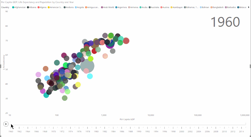
Here’s what we’re going to create:
Data Visualisation – Getting the Data
For this walkthrough, I’m going to use several datasets from the World Bank Open Data project relating to population, life expectancy, and per capita GDP. Each of these is available in CSV format, broken down by country and year since 1960.
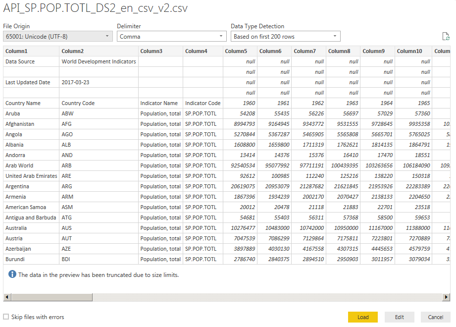
Having downloaded and extracted the datasets from their Zip files, the first thing to do is pull them into Power BI. Clicking “Get Data” gives you many import options, one of which is the option to import from a CSV or text file. I’ll illustrate the process with the Population dataset – all of them share the same layout, so the procedure is the same.
On importing the dataset, the first thing you’ll find is that it’s not in a particularly useful format. There are several rows before we get to the actual data, and it’s laid out in a table that makes perfect sense in a spreadsheet, but isn’t very helpful for analysis in Power BI.
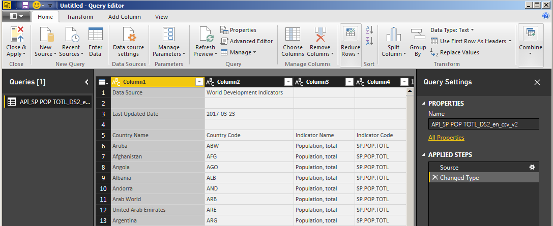
Fortunately, fixing all these issues is really easy. Clicking “Edit” in the import dialog lets you modify the dataset you’re importing in the Query Editor:
The first thing to do is to get rid of those useless header rows. Click “Reduce Rows” and choose “Remove Rows”, then “Remove Top Rows”, and enter “4” when asked how many rows to remove.
Next, use the first row (of the remaining rows) to provide our column headers – simply click “Use First Row as Headers”:
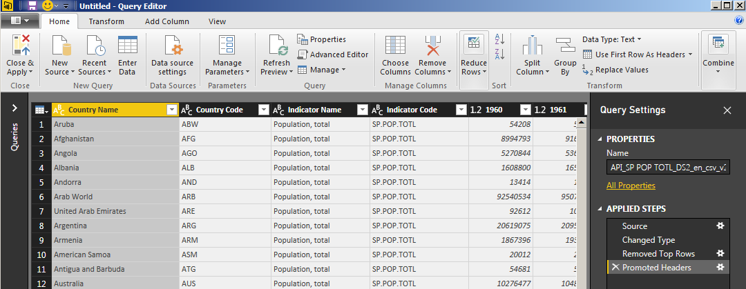
That gives us a much more useful data table, but there’s still one problem. Each year appears as a separate column in this dataset, and what we need for the analysis is columns for the year, and for the data value for that year, for each country.
To do that, you can hold Ctrl and click on each of the first four column headers to select the columns. Right-click on them and choose “Unpivot Other Columns” from the context menu:
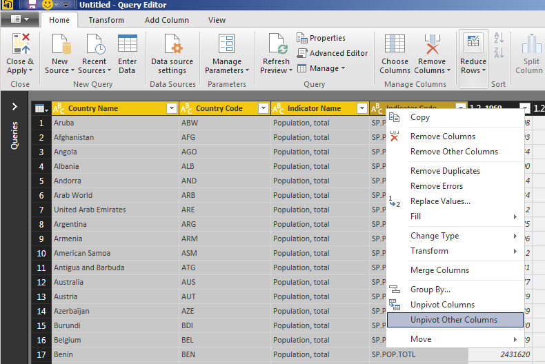
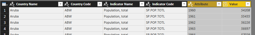
This gives us a table with the columns Country Name, Country Code, Indicator Name, Indicator Code, Attribute, and Value, with the years in the Attribute column, and the values for each year in the Value column:
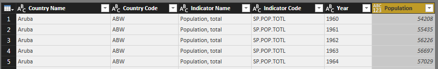
Now, all you need to do is rename the ‘Attribute’ column to ‘Year’, and the ‘Value’ column to ‘Population’, and you have exactly the dataset you want:
We also need to ensure that the data value column (Population) is set to the correct data type – here it’s been incorrectly detected as having mixed valued. Click on the datatype indicator in the column header and change it to “Decimal Number”.
At this point, you can click “Close & Apply” in the ribbon to import our Population data, and then repeat the process to import our other two datasets (Life Expectancy and GDP Per Capita).
You might also want to rename the imported tables, since the original filenames aren’t particularly useful.
You should now have three data tables available to us in the Power BI designer. We could easily chart each one on a line chart, showing (for example) Life Expectancy vs Year by country.
To do this, click the ‘line chart’ button under ‘Visualizations’, then drag ‘Year’, ‘Country Name’ and ‘Life Expectancy’ from Fields into ‘Axis’, ‘Legend’ and ‘Values’ respectively:
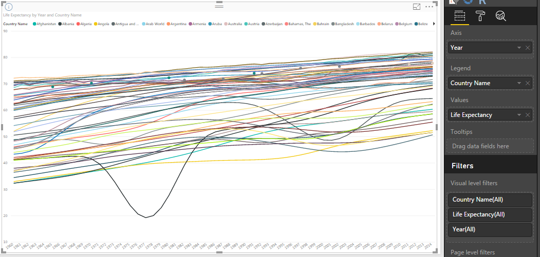
However, if you try to use this type of chart to see how the three variables relate to each other over time, you’ll find it very difficult to get any feel for the data. Instead, a scatter plot lets us show all three variables on a single chart, and then animate it over time to see how they evolve.
Managing Relationships
To relate all three datasets together, you need to define some relationships between them. Go to the Modelling ribbon tab, choose “Manage Relationships”, and try to set up some new relationships – for example, to relate each of the “Year” columns in our tables to each other.
Unfortunately, if you try to do this with our data as-is, you’ll quickly encounter an error that one of the columns needs to supply unique values:
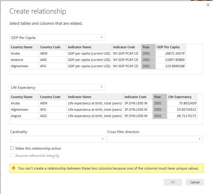
What we need to do is create what is known in Data Modelling terms as a dimension table, which provides all of the unique values which our dimension (Year, in this case) can take.
Fortunately, we can do this quite easily using Data Analysis Expressions (DAX).
On the Modelling ribbon tab, click “New Table”. This creates a new calculated table in our data model, and places the cursor in the Formula bar where you can enter a DAX expression to define it.
We want to take the distinct Year values from one of the existing datasets. To do this, enter this expression:

This gives you a Years table, with one Year column. You can now use the Manage Relationships window to relate the Year column in each of our data tables to the new Year dimension:
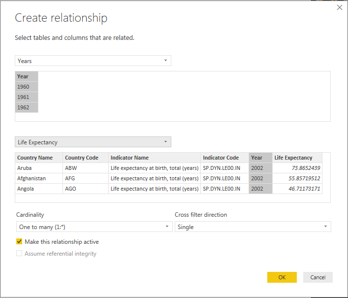
You can accept all the default options here, and continue to create relationships for the other data tables.
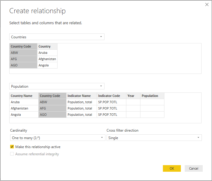
Let’s define a similar dimension table and set of relationships for our countries. This time, I’ll use a slightly more complicated DAX expression to create a table which contains both the country name and the country code.
This is a useful technique if you have data where the labels (country names in this case) are not necessarily unique, but have unique codes or IDs associated with them. Fortunately, Power BI assists you with creating the query by autocompleting fields and functions:

This expression uses the SELECTCOLUMNS function to return a table with named columns.
You can now go ahead and create relationships between the Country Code column in our Countries dimension table and the corresponding columns in the data tables:
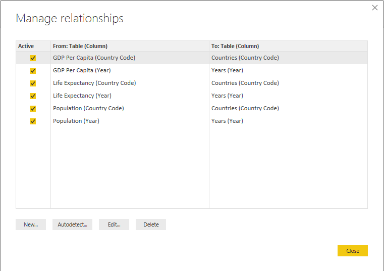
Now, you should have all of the relationships we need between our tables:
It’s time to start creating the visualisation!
Scatter Charts
What we’re going to do is to add a Scatter Chart visual to the report page, stretch it out to cover the full page, and set the appropriate fields.
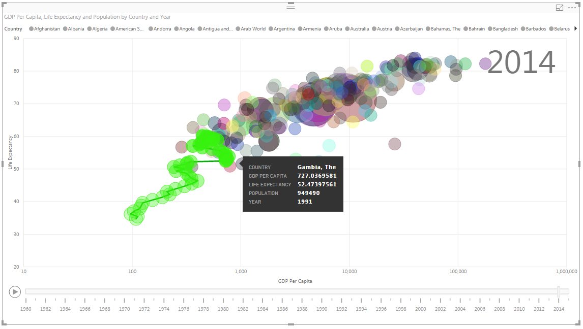
Use the Country Name (from the Countries dimension table) for the Legend, put GDP Per Capita on the X-axis, Life Expectancy on the Y-axis, and Population for the marker size.
Finally, the real magic happens when you set Year (from the Years dimension table) for the Play axis – this creates a slider for Years across the bottom of our chart, with a “Play” button.
If you hit play now, you can watch our chart evolve over time!
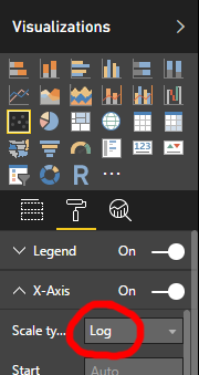
However, a small problem quickly becomes apparent – most of the data points cluster very close to the left-hand side of the X-axis. The obvious issue here is that some countries (like Lichtenstein) are such outliers on per-capita GDP that they compress the entire axis.
The solution to this is to use a logarithmic scale – by selecting the formatting options for the visual, you can change the type of the X axis.
Now, it’s easy to see the evolution of life expectancy, GDP, and population from 1960 to 2014, in a very clear and visually arresting way:
As a final bonus, if you click on any of the bubbles, you can see a trend line and the complete history of its development:
Using Power Bi Map to Visualise Data on Maps
Visualising data on maps is a powerful way of communicating information, but it’s always been difficult to achieve. Now Power BI gives everyone the chance to go places with their data.

One of the most powerful ways to visualise data is spatially. Used appropriately, map-based data visualisations can make otherwise-invisible connections obvious, bringing your data to life in a very immediate and visually-compelling way.
This kind of visualisation has long been difficult to create, needing expensive and complex software. Fortunately, Power BI now offers two easy-to-use map visualisations that bring this capability within anyone’s reach.
Geographical Data
The map visualisations in Power BI can work with various different kinds of geographical data, from place names and postal codes to precise latitudes and longitudes. If your data has latitude and longitude data, this is the best option (since it’s completely unambiguous), but Microsoft offers a number of tricks you can use to improve the recognition of your geographical data.
Basic (or Bubble) Maps
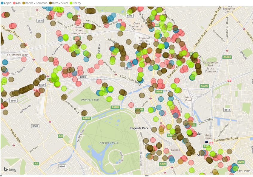
The simplest and most versatile map visualisation is the Basic Map, also known as Bubble Map. This visualisation places circular markers for each data point on a standard map.
The simplest way to use this visualisation is to show locations divided into different categories. For example, this visualisation shows the locations of different types of tree in Camden, London (this data comes from the excellent Open Data Camden project).
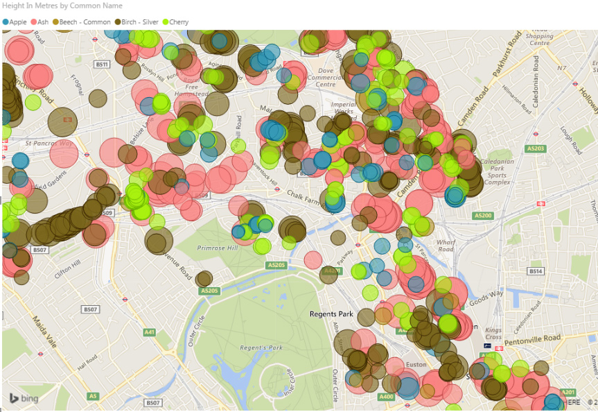
Any additional data associated with each location can be shown in several different ways, depending on how your data is structured. If you have just a single value for each location, that can be used to determine the size of the marker.
Here is the same visualisation, but with the markers sized according to the height of each tree.
If you have several categories of data for each location, you can display them as pie charts. Here is an example (using made-up data) showing visitor numbers at three locations, broken down by ticket type:
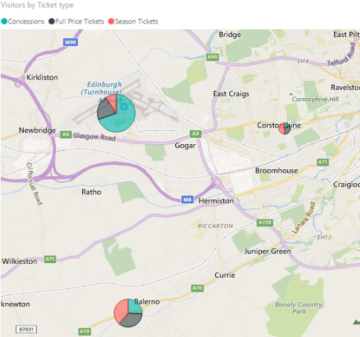
The overall size of each marker shows the total of all categories, while the pie chart within the marker shows the category breakdown.
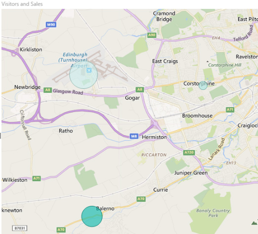
Finally, you can visualise two different data values per marker by using one to set the size of the marker, and the other to set the colour saturation. However, you cannot combine this with any categorisation. For example, we can show both total visitors (size) and total sales (saturation) at each of our locations like this:
Filled Maps
The other standard map visualisation available in Power BI is the Filled Map (also known as a choropleth). This type of map shows regions filled with colour, with the colour saturation representing the value.
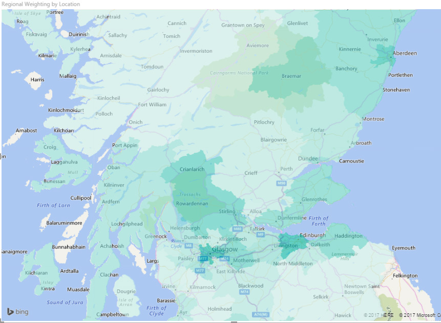
Making effective use of the Filled Map visualisation is a little more difficult than the Basic Map. The available regions are limited to those that Bing Maps can understand, and their geographic coverage sometimes leaves a little to be desired, especially outside the USA. It also becomes tricky if you move away from the standard Country/Region/State/County model. So, for example, you can’t use parliamentary constituencies as your regions, because they don’t fit Bing’s default geographical model.
Other Options for Map Visualisations
There are a couple of other map visualisation options available, but these are currently only in preview, so I won’t go into them in too much depth. Preview features need to be manually enabled within Power BI.
Shape Maps are broadly similar to Filled Maps, but let you choose different pre-defined maps (such as US states or the counties of Ireland) as the base map. There is also the promise that Shape Maps will offer the ability to define custom areas using TopoJSON code when the feature comes out of preview.
The ArcGIS Map visualisation is supplied by Esri, one of the leaders in the field of Geographical Information Systems (GIS). It lets you select from several different base maps, and apply different “reference layers” as overlays. As well as letting you plot location points of varying sizes (like the Basic Map), you can also show your data as a heat map, or as counts of values within regions.

Announcing a Vibrant Step Forward: CompanyNet Unveils New Logo
We’re excited to share some significant news with our valued customers, partners, and followers. Since…

Microsoft 365 usage optimisation – why it matters, and how to do it
Your organisation’s investment in Microsoft 365 means a more connected, satisfying and productive experience for…

It’s time to consider Microsoft 365 for Records Management

Get the most from your investment in enterprise Microsoft 365 with our Technical Assurance Service

Leveraging Evergreen IT for maximum benefit